Every project is crafted with expertise and passion
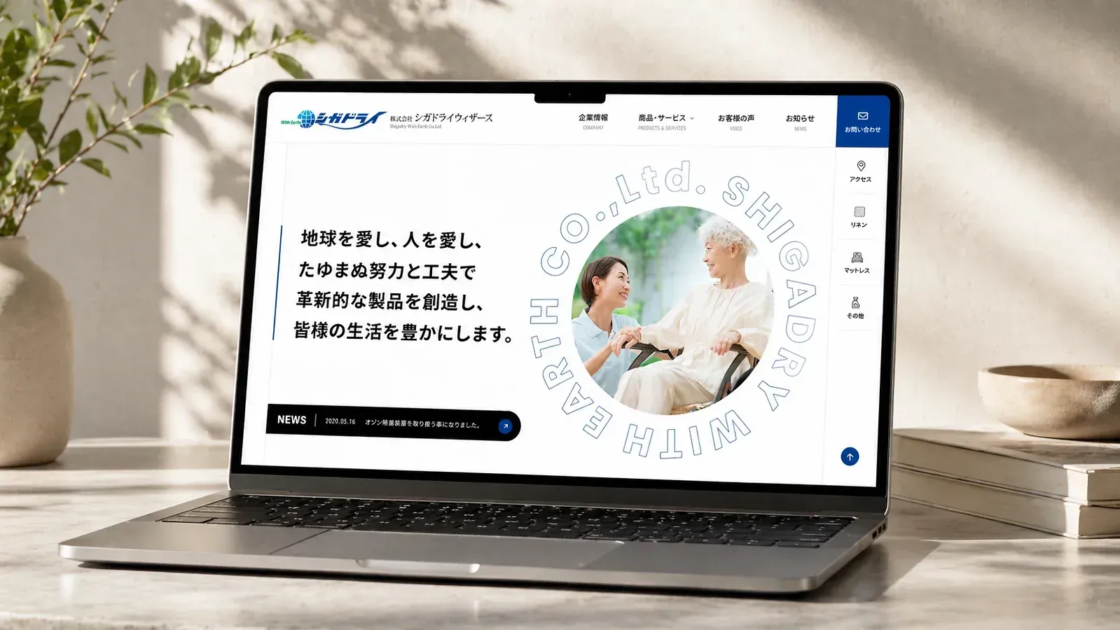
We created a corporate website for Shigadry With Earth, specializing in elderly care services. Using a clean white and blue color scheme paired with warm, human-centric lifestyle photography, the site conveys the brand’s philosophy of "loving the earth and loving people." Through clearly structured sections including company information, products and services, and customer testimonials, it intuitively presents its solutions for care products like linens and mattresses tailored to medical and nursing facilities. The design balances professional credibility with compassionate warmth, building a trustworthy and human-centered online portal for the brand.
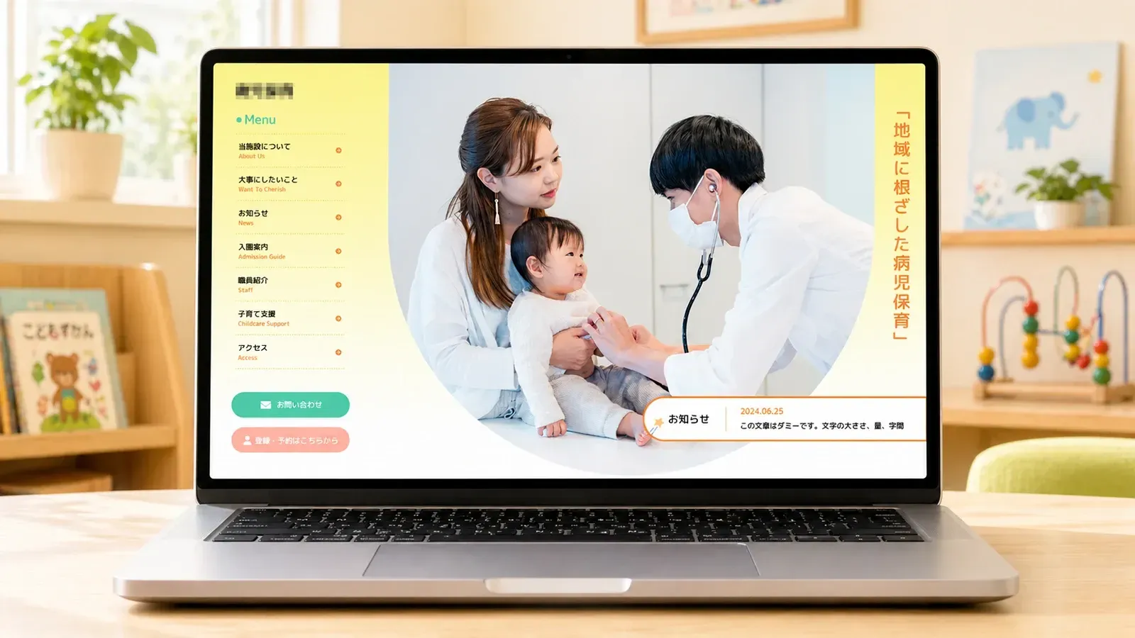
This official website for a pediatric childcare facility uses soft light yellow, mint green, and warm orange as its main colors, paired with rounded corners, wavy lines, and star decorations to create a warm, reassuring, and child-friendly atmosphere that perfectly reflects the institution’s core philosophy of being rooted in the community and caring for sick children. The page adopts a segmented linear layout, with clear sections such as “About the Facility,” “What We Cherish,” and “Admission Guide” to orderly present information about the institution, childcare philosophy, admission process, and services. Large circular photos vividly show warm interactions between medical staff and children, strengthening parents’ trust in the facility. A fixed left navigation bar and prominent contact buttons ensure parents can quickly find the information they need; simple illustrations and contact details at the bottom further lower communication barriers, creating a pediatric childcare service website experience that balances professionalism, approachability, and ease of use.
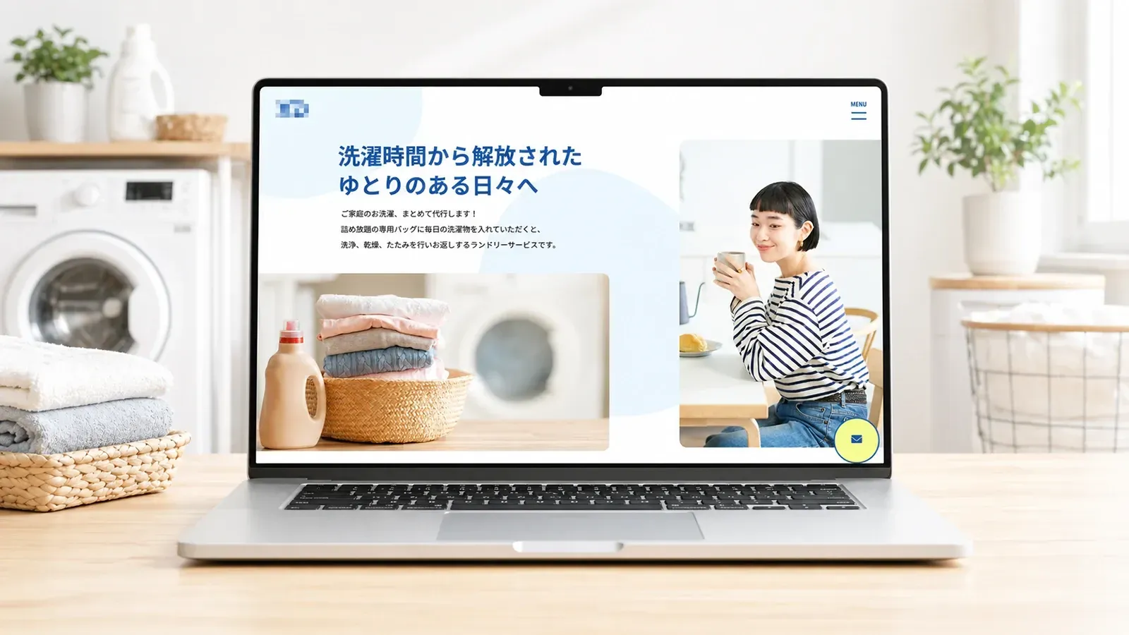
The official website of Laundry Service uses fresh light blue and navy blue as its main color scheme, paired with soft wave lines and bubble elements to convey a clean, refreshing, and relaxed brand image that perfectly aligns with the service’s core promise of “freeing users from laundry time.” The page adopts a linear narrative layout, starting with user pain points and using illustrated cards to intuitively present target user personas, service advantages, and usage processes, enabling users to quickly build resonance and trust. The combination of real-life scene photos and minimalist line illustrations balances the service’s practicality with approachability; clear comparison sections, step-by-step guidance, and prominent application buttons effectively reduce user comprehension barriers and action thresholds, creating a clean, concise, information-efficient, and user-centric lifestyle service website experience.
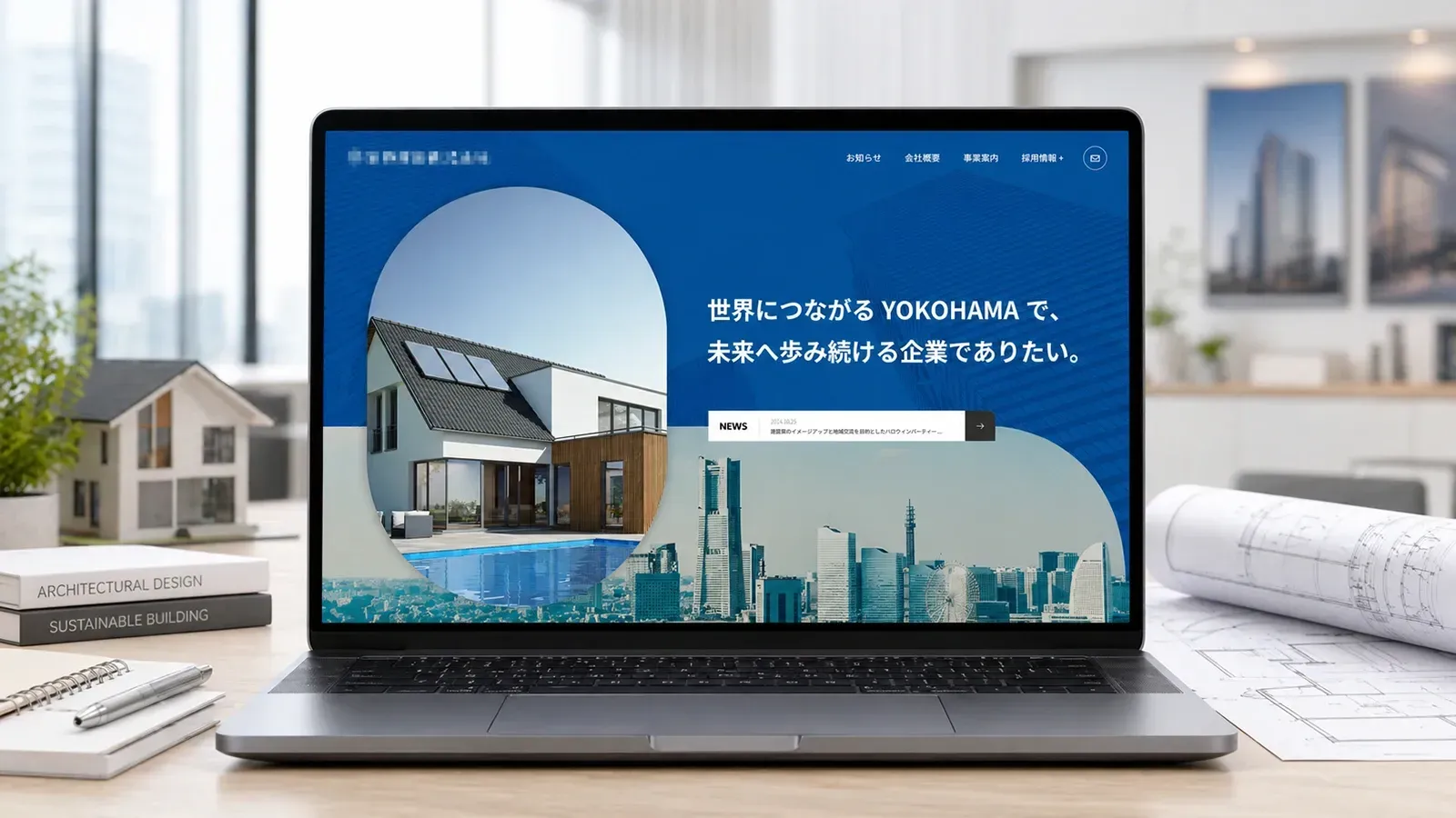
The official website of Japanese Real Estate & Construction. uses deep, calm blue as its main color scheme, conveying the professionalism, reliability, and forward-thinking nature of the construction industry, in line with the brand’s vision of “rooted in Yokohama, moving toward the future.” The page adopts a modular linear layout, opening with large images of city skylines and modern architecture to establish a grand and professional tone. It clearly divides sections for company introduction, services, recruitment, and contact information, using on-site photos and categorized cards to showcase diverse business strengths including civil engineering, construction work, materials management, and more. The large blue background and restrained typography reinforce the brand’s steady temperament; the top navigation and bottom information entry points ensure user-friendly browsing, creating a construction corporate website experience that balances trustworthiness, professionalism, and future-oriented vision.
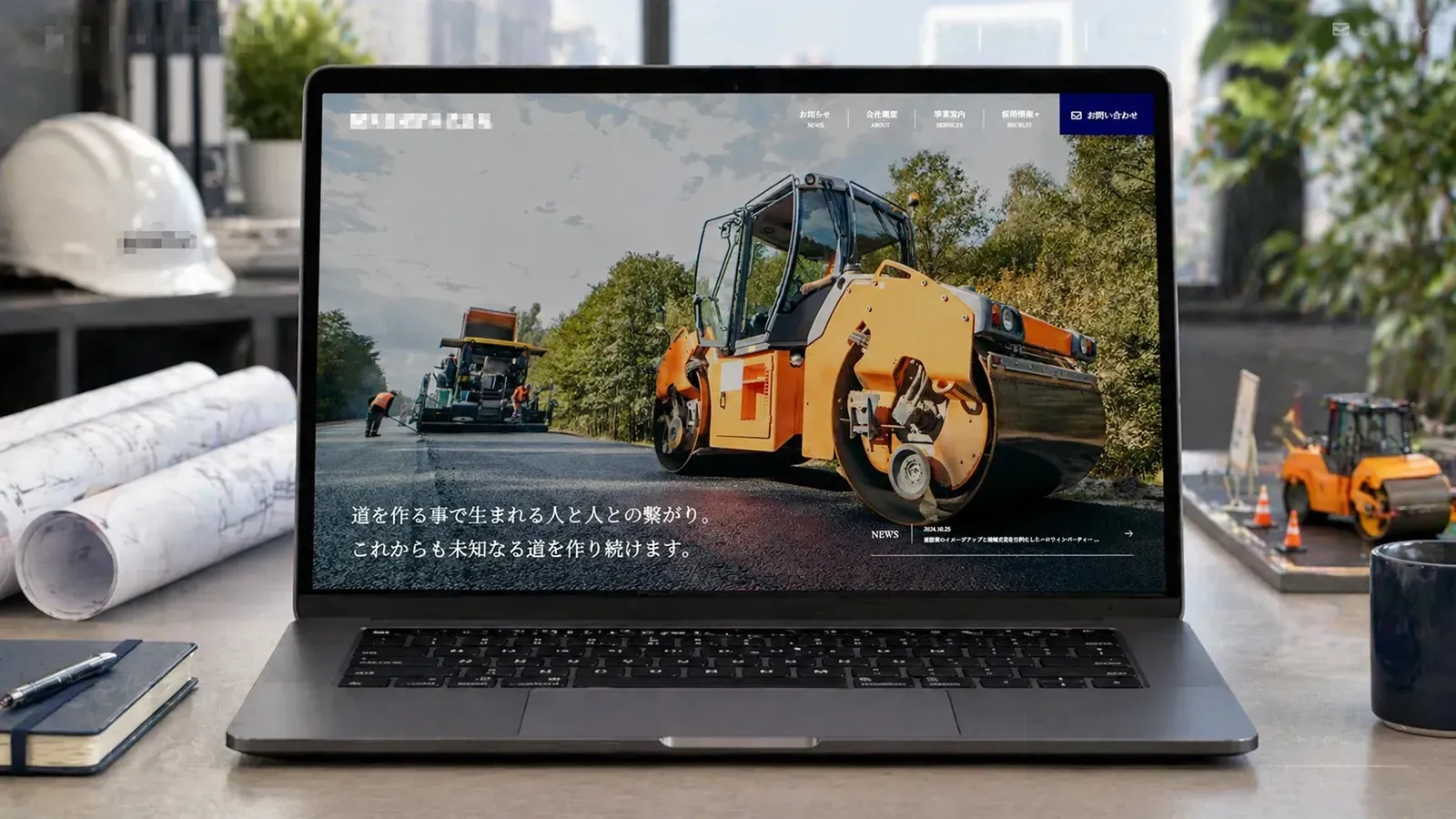
The official website of Civil Engineering Construction. uses deep navy blue and calm white as its main color scheme, conveying the professionalism, reliability, and solidity of the civil engineering industry, aligning with the brand’s philosophy of “connecting people through road construction.” The page adopts a modular linear layout, opening with large images of construction vehicles on-site to establish a grand, professional tone. It clearly divides sections for company introduction, services, recruitment, and contact information, using on-site photos and navy blue information cards to showcase core business strengths such as civil engineering paving and road repairs. Restrained typography and minimalist geometric backgrounds reinforce the brand’s rigorous temperament; the top navigation and bottom contact details ensure user-friendly browsing, creating a civil engineering corporate website experience that balances trustworthiness, professionalism, and social responsibility.
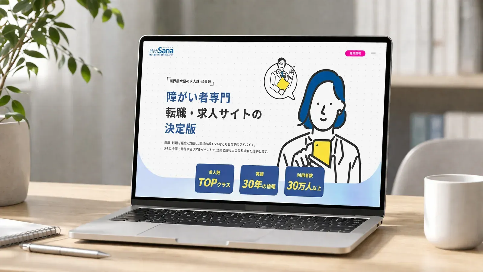
This project is a brand landing page design for WebSana, a dedicated job recruitment platform for people with disabilities in Japan. The core objectives are to build brand trust among target users, communicate the platform’s value proposition, and guide users to complete registration conversions. Centered on user experience, the design adopts a clean and soft light blue primary color scheme paired with minimalist flat illustrations, alleviating the anxiety associated with job searching and creating a professional yet warm brand atmosphere. The page follows a progressive narrative logic of Trust Building - Empathy for Pain Points - Value Breakdown - Scenario Validation - Call to Action: Opening with three core metrics (top-tier recruitment resources in the industry, 30 years of service track record, and over 300,000 users) to quickly establish brand authority; Naturally introducing the platform’s five core advantages through user pain point scenarios to clearly communicate service value; Enhancing the platform’s credibility with rich scenario displays, including job fairs, partner companies, and exclusive career support services; Inserting highly recognizable call-to-action buttons throughout the page to lower conversion barriers and form a complete conversion funnel. The overall design balances efficient information delivery with the emotional needs of target users, striking a perfect balance between brand professionalism and user-friendliness, effectively boosting users’ trust in the platform and their willingness to register.
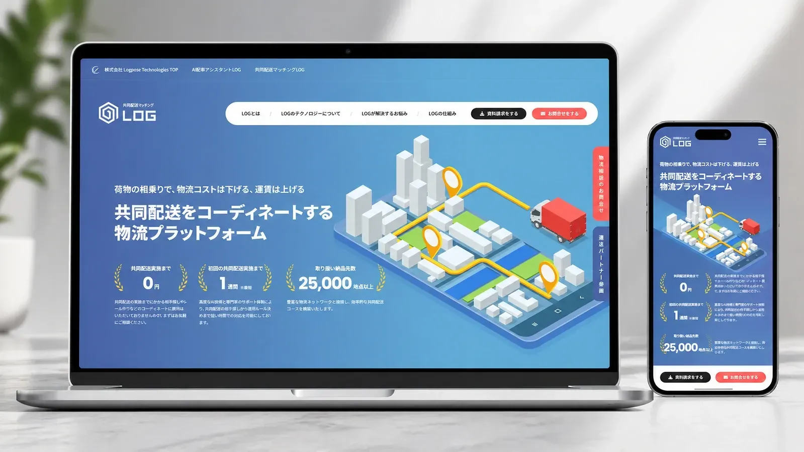
This project is the official website design for LOG, a Japanese logistics technology company specializing in collaborative delivery platforms. Centered on the core theme of "AI-driven cost reduction and efficiency improvement," the design adopts a clean blue-and-white color scheme paired with tech-inspired illustrations to convey a professional and reliable tech brand image. The page follows a progressive narrative logic of Value Proposition - Technical Advantages - Pain Point Solutions - Service Process - Conversion Guidance, clearly demonstrating how the platform optimizes logistics resources and controls costs through AI algorithms. Catering to the core needs of both shippers and carriers, it achieves efficient information delivery and user conversion, perfectly balancing the professional credibility and user-friendliness required for B2B tech products.
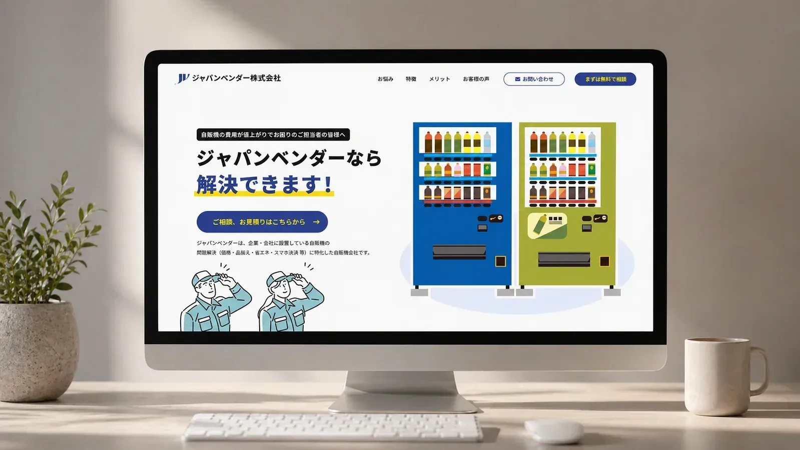
We created a corporate website for Japan Vendor Co., Ltd. Using a clean blue-and-white color scheme with friendly illustrations, the site follows a linear narrative of pain points, service benefits, and case studies to clearly communicate the differentiated value of its vending machine services. While maintaining the professionalism of a B2B service, the intuitive information presentation and conversion-focused design reduce customer understanding costs and support the brand’s efficient lead generation.
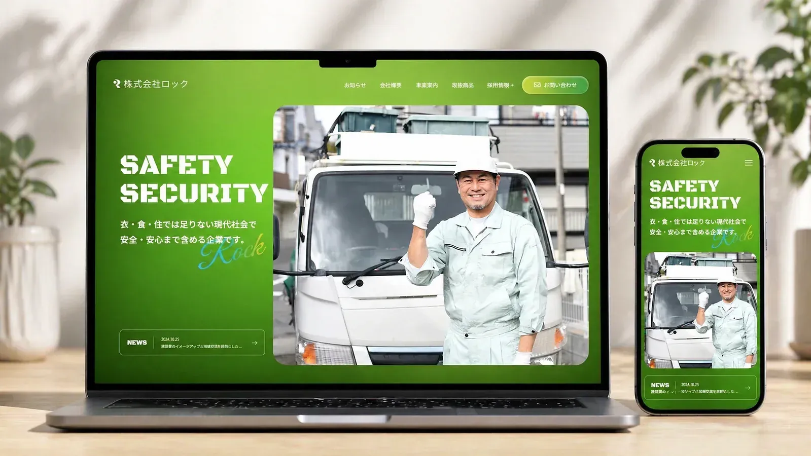
We created a corporate website for Rock Co., Ltd., using a vibrant gradient green as the main visual to express the brand’s core commitment to delivering "safety and security" across all areas of life—clothing, food, and housing. With a clear narrative structure featuring sections like ABOUT, SERVICES, and PICK UP, the site intuitively presents its diverse business lines, including building materials sales, construction services, and daily necessities supply. By combining high-quality on-site construction photos with lifestyle-focused visuals, the design balances the professional credibility of the construction industry with the approachable warmth of a service-oriented company. Enhanced recruitment and contact modules also establish efficient pathways for talent acquisition and customer conversion, resulting in a cohesive website that perfectly aligns brand identity, business showcase, and user experience.