Japanese Real Estate & Construction Website
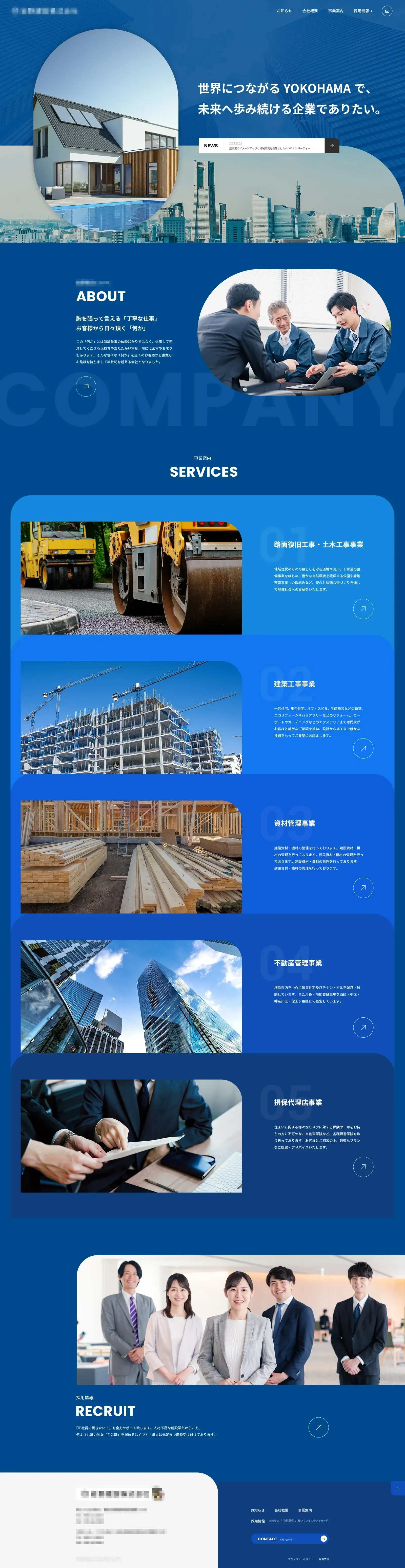
The official website of Japanese Real Estate & Construction. uses deep, calm blue as its main color scheme, conveying the professionalism, reliability, and forward-thinking nature of the construction industry, in line with the brand’s vision of “rooted in Yokohama, moving toward the future.” The page adopts a modular linear layout, opening with large images of city skylines and modern architecture to establish a grand and professional tone. It clearly divides sections for company introduction, services, recruitment, and contact information, using on-site photos and categorized cards to showcase diverse business strengths including civil engineering, construction work, materials management, and more. The large blue background and restrained typography reinforce the brand’s steady temperament; the top navigation and bottom information entry points ensure user-friendly browsing, creating a construction corporate website experience that balances trustworthiness, professionalism, and future-oriented vision.