PRISM ART
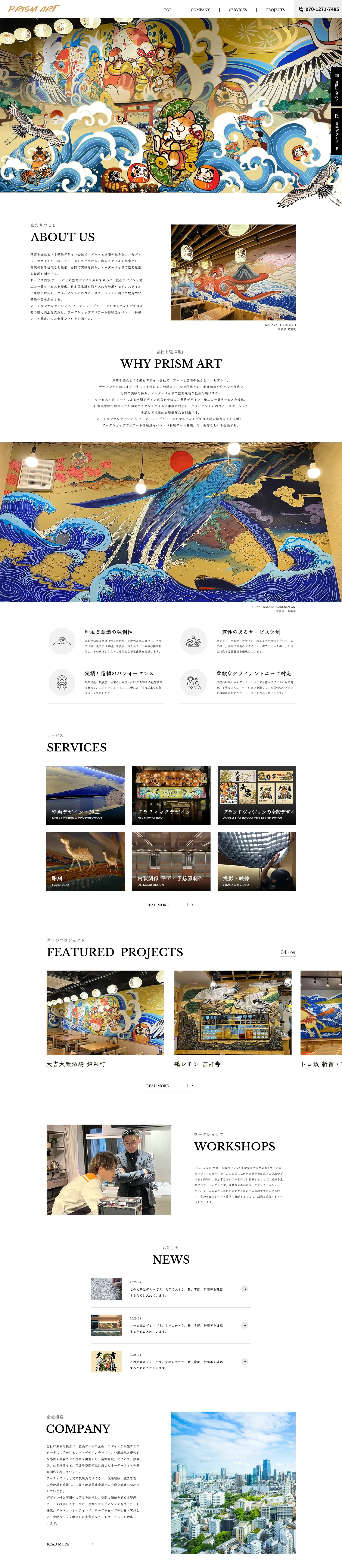
The official website of PRISM ART, a Japanese art and design studio, uses pure white as its base color to fully highlight the vivid colors and delicate brushwork of its Ukiyo-e-style murals, using large areas of negative space to accentuate the impact of the works, creating a visual tone that is minimalist yet artistically striking. The page adopts a top-to-bottom modular linear layout, clearly dividing sections such as brand introduction, core philosophy, services, project works, workshops, and news, deeply integrating traditional Japanese aesthetics with modern minimalist typography. Large-scale works and categorized cards directly convey the studio’s creative strength and unique style; the fixed top navigation and sidebar entry ensure browsing convenience, while restrained text layout and orderly information hierarchy balance artistic expression with brand professionalism. Users can intuitively experience the studio’s creative energy and service value through immersive work displays, and the brand’s Japanese aesthetic philosophy is fully conveyed.